
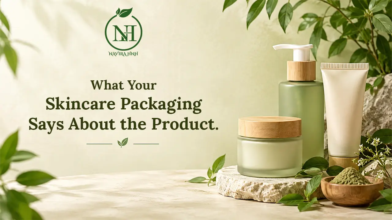
Walk down
any skincare aisle, or scroll through an online store, and you'll notice
something quickly: before you read a single ingredient, the skincare
packaging has already told you a story. The color, the material, the
wording and even the way a lid closes all shape your first impression.
In this
guide, you'll learn how to read that story. We'll look at what different
packaging choices can reveal about quality, care and honesty, and how to tell
the difference between packaging that informs and packaging that simply
decorates. Understanding this matters because most of us spend real money on
skincare, and the box or bottle is often the only information we have before buying.
Why Skincare Packaging Matters More Than You Think
Packaging
isn't only about looks. Good cosmetic packaging
has three jobs:
- Protect the formula from light, air, heat and
contamination
- Communicate information about what's inside and how
to use it
- Reflect the brand's values, from quality standards to
environmental care
When a
brand gets these three things right, it usually shows that someone thought
carefully about the whole product, not just the marketing. That doesn't
automatically make a product better for your skin, but it's a useful clue.
What Skincare Packaging Design Can Reveal
Skincare
packaging design is often
the first thing that catches your eye. Here's what to look for beyond the
surface.
Simple Design vs. Overloaded Design
Clean,
clear layouts tend to make information easier to find. If a pack is crowded
with bold claims, stars, badges and slogans, it can be harder to spot what
actually matters, such as the ingredient list and usage directions.
That
said, minimal design isn't automatically honest, and colorful design isn't
automatically misleading. The question to ask is: can I easily find the
information I need?
Color and Style Cues
Green,
earthy tones and botanical illustrations are popular in natural skincare packaging, but these are design choices, not
proof of what's inside. A leaf on the label doesn't tell you how much of a
plant ingredient is in the formula. Always check the ingredient list to see
what the product really contains.
Consistency Across the Range
Brands
that care about detail usually keep their fonts, labels and information style
consistent across products. Sudden changes in printing quality, spelling errors
or mismatched labels can be a sign that less attention went into the finished
product.
Packaging Quality: The Small Details That Count
Packaging
quality often
tells you how much thought went into protecting the formula. A few things worth
checking:
- Secure closures: Caps, pumps and lids should
fit properly and not leak.
- Tamper-evident seals: A sealed cap or inner liner
shows the product hasn't been opened before.
- Clear, lasting print: Labels shouldn't smudge or
peel easily, especially in a humid bathroom.
- Sturdy material: Thin, flimsy containers may
not protect the contents as well over time.
Why Tinted Glass and Opaque Containers Are Common
Some
ingredients, particularly plant-based oils and extracts, can be affected by
light. That's why you'll often see amber or dark glass and opaque
bottles used for oils and serums. It's a practical design decision, and it can
be a good sign when the container suits the formula.
Sustainable Skincare Packaging: What to Look For
More
people are paying attention to the environmental side of beauty. Sustainable
skincare packaging is about reducing waste across the product's life, from
making the container to what happens after it's empty.
Common
approaches include:
- Recyclable materials such as glass, aluminum and
certain plastics
- Refillable containers that reduce repeat
packaging
- Recycled content in bottles or cartons
- Minimal outer packaging, avoiding extra boxes and
layers
- Clear disposal guidance on the label
Be Careful With Vague Green Claims
Eco-friendly
skincare packaging is a wonderful goal, but the phrase itself can be used loosely. Words
like "green," "earth-friendly" or "planet-loving"
don't mean much without detail.
Look for
specifics instead:
- What is the container made
from?
- Is it recyclable in most
areas, or only in special facilities?
- Does the brand explain how
to recycle or reuse it?
Specific
answers are usually a better sign than big claims.
How to Read Skincare Product Labels
If
packaging is the cover of the book, the label is the story. Learning to read skincare
product labels is one of
the most useful habits you can build.
What a Helpful Label Usually Includes
Depending
on where you live, requirements vary, but a clear label commonly shows:
- Product name and purpose
- Full ingredient list
- Net quantity (weight or volume)
- Directions for use
- Usage cautions or warnings
- Batch number and
manufacturing details
- Manufacturer or brand
contact information
- Shelf life or a
period-after-opening symbol
Understanding Skincare Ingredient Labels
Skincare
ingredient labels can look
intimidating at first, but a few basics make them much easier:
- Order matters. In many regions,
ingredients are listed from the highest amount to the lowest.
- Botanical names are often in Latin, such as
Aloe barbadensis for aloe vera. This helps avoid confusion between
similar plants.
- Short lists aren't always
better,
and long lists aren't always worse. What matters is whether each ingredient
makes sense for the product.
If a
brand highlights a "hero" herb on the front but you can't find it on
the ingredient list, that's worth noticing.
Tip: Check the Front and the Back
The front
of a pack is designed to attract you. The back is designed to inform you. Get
in the habit of turning the product around every time.
Skincare Product Transparency: The Sign of a
Trustworthy Brand
Skincare
product transparency means a brand is open about what it makes, how it makes it and what its
products contain. You can often see it in the packaging itself.
Signs of
transparency include:
- Complete ingredient
information,
not just a few highlights
- Honest wording that avoids exaggerated
promises
- Easy-to-find contact details for questions
- Clear storage and usage
instructions
- Straightforward sourcing
information
where the brand chooses to share it
Be
cautious with packaging that promises dramatic outcomes or uses phrases like
"instant results." Skincare works gradually and differently for everyone,
so realistic wording is usually a healthier sign.
Natural Skincare Packaging and Herbal Products
If you
enjoy herbal
skincare products, packaging can help you judge how carefully a brand
treats botanical ingredients.
Herbs and
plant extracts can be sensitive to light, heat and air. So thoughtful natural
skincare packaging often includes:
- Dark or tinted containers for oils and extracts
- Airtight closures to protect freshness
- Storage tips such as "keep in a
cool, dry place"
- Batch details so you know when a product
was made
It's also
worth remembering that "natural" is not a regulated promise in every
market. A product can be described as natural and still contain a mix of
ingredients. Read the label, and don't rely on the word alone.
For those
drawn to Ayurveda-inspired routines, look for clear ingredient names,
traditional herbs listed properly, and simple usage guidance rather than bold
claims.
A Practical Checklist for Choosing Skincare
Products
Next time
you're choosing skincare products, run through this quick list:
- Is the ingredient list
complete and easy to read?
- Does the container suit the
formula?
(Dark glass for oils, pumps for lotions)
- Is the seal intact and the
print clear?
- Are the claims realistic? Avoid anything that sounds
too good to be true.
- Is there usage and storage
guidance?
- Can you find batch and brand
information?
- Does the brand explain its
packaging choices, especially recycling or refilling?
- Does it suit your skin? Do a patch test first, and
speak to a professional if you have sensitive skin or a skin condition.
Think of
this as a two-minute habit that can save you money and disappointment.
Common Packaging Red Flags
Keep an
eye out for:
- Damaged or missing seals
- Spelling mistakes and blurry printing
- No ingredient list or a list that's hidden or
incomplete
- Missing brand or batch
information
- Very bold claims with little explanation
- Leaking or poorly fitting
lids
One red
flag doesn't always mean a poor product, but several together are a good reason
to pause.
Conclusion
Your skincare
packaging is more than a pretty wrapper. It shows how a brand thinks about
protection, honesty and responsibility. Well-chosen containers help keep
formulas fresh, clear skincare packaging information helps you use
products properly, and thoughtful sustainable skincare packaging shows
care beyond the bottle.
Remember,
though, that packaging is only one piece of the picture. A beautiful jar can't
replace a good formula, and a simple tube can hold a wonderful product. The
goal isn't to judge by looks, but to use packaging as a starting point: read
the label, check the ingredients, look for realistic wording and notice the
small details of quality.
With the
checklist above, you can shop more confidently and choose products that fit
your values, your routine and your skin. Start small: next time you pick up a
product, turn it over, read the back and ask what the packaging is really
telling you. Over time, those little habits make choosing skincare
products simpler and more enjoyable.
At Herb
& House, we believe informed choices are the foundation of a mindful,
natural-living routine, so take your time and enjoy the process.